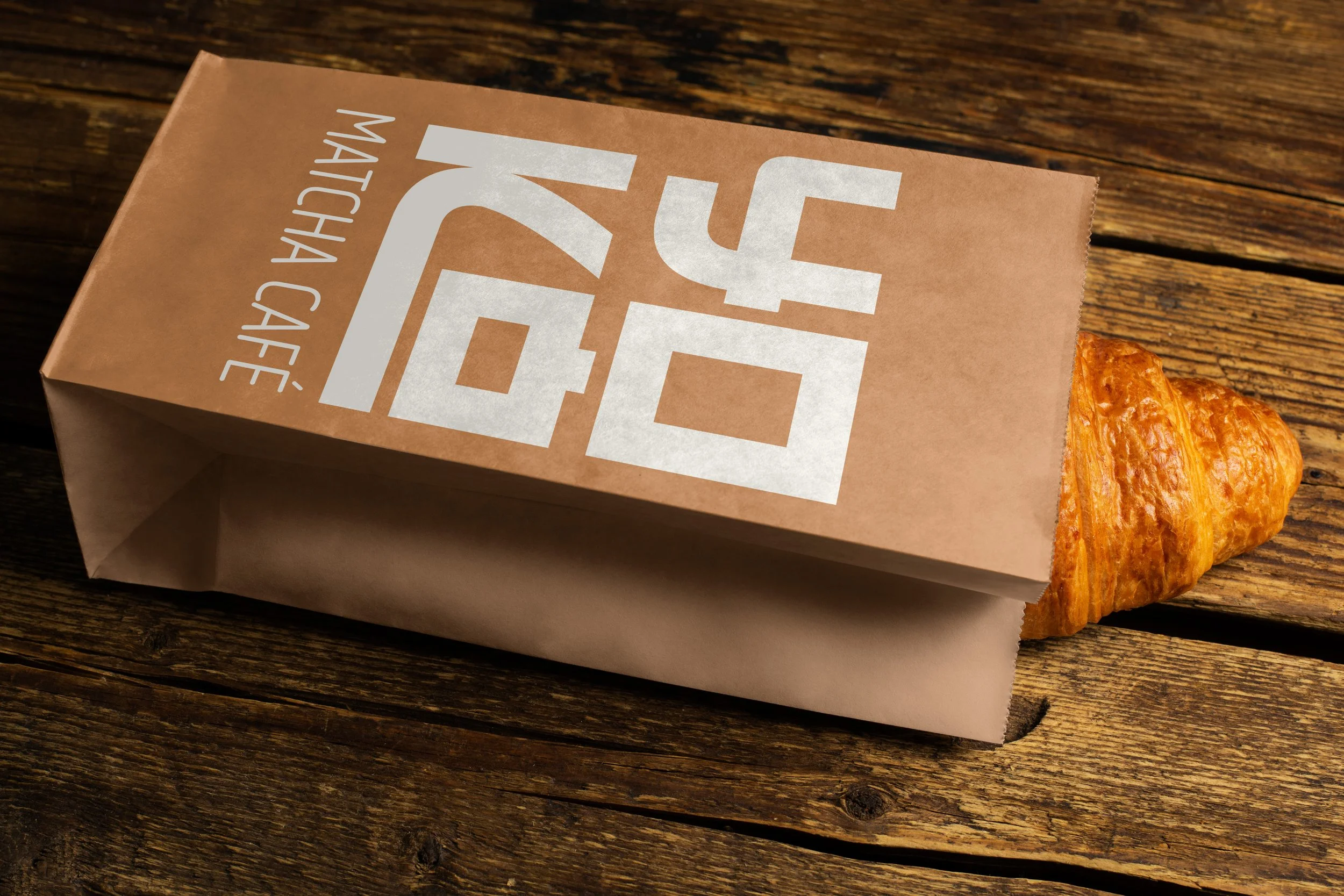
Yoko Matcha
Yokō is a Japanese matcha bar inspired by Tokyo’s quiet side streets and fast-paced city life.
It’s made for urban people who move quickly but love moments of stillness.
Every drink is prepared slow, to help others slow down.
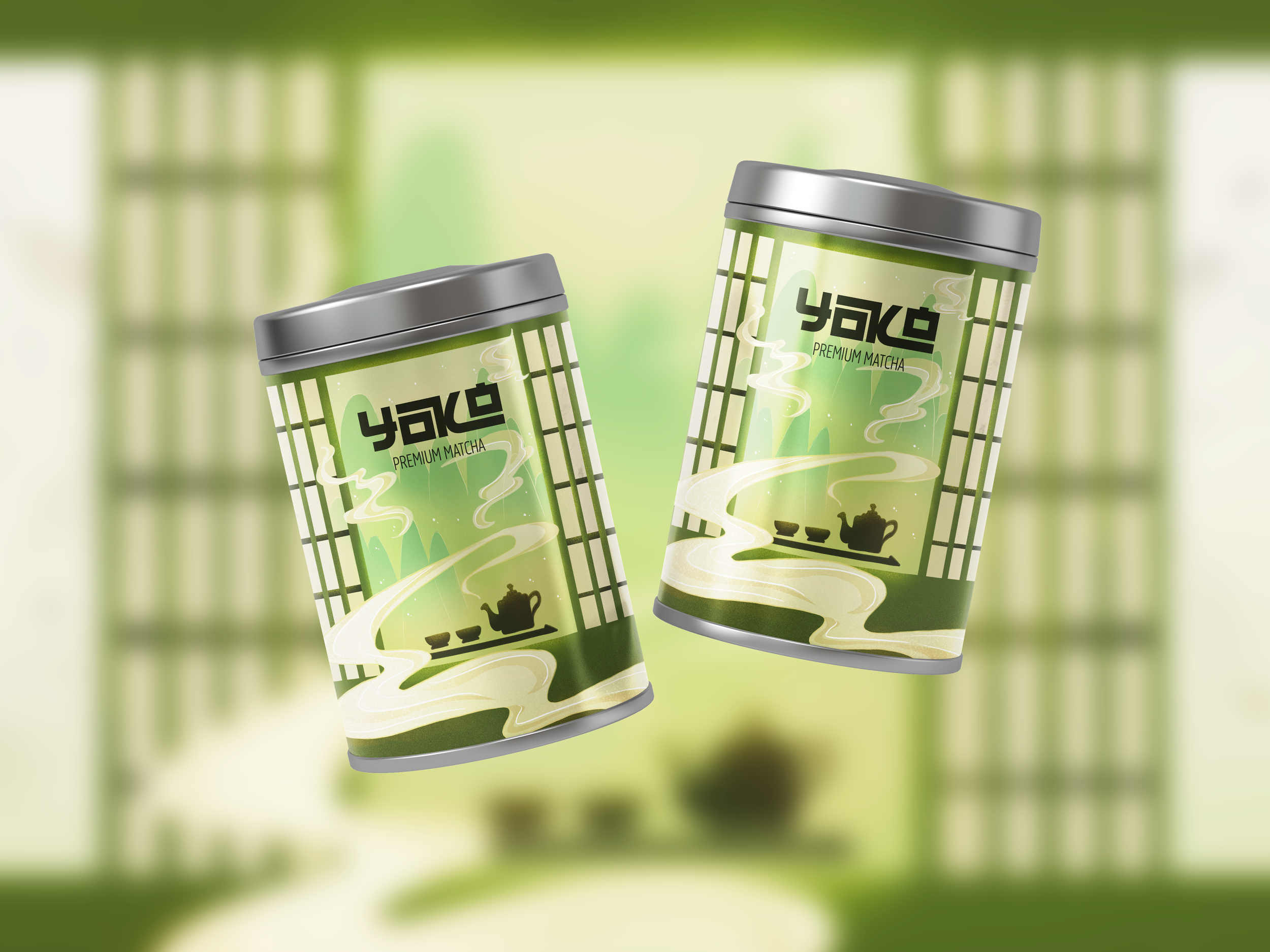
The design of the illustration, which is the main focus for the packaging - and has been repurposed to work on apparel as well (totebags in this case), was made to create the feeling of slowing down, enjoying a moment of silence, appreciate the scenery while savouring the taste of premium matcha.
There are two cups in the illustration, to signal that it’s best to enjoy the tea with your closest people, and the steam coming out of the teapot redirects the viewer’s eyes to the logo.
Illustrations can make packaging more appealing, memorable, and effective in communicating a brand's personality and product benefits. They can evoke emotions and create a connection with consumers, influencing their purchasing decisions. Furthermore, studies show that packaging with images, including illustrations, can increase purchase intent.